Wednesday, January 16, 2013

Valerie Hegarty - Different and Beautiful Art

Check out the art below, it's a  mixture of sculpturing and painting talents (since she actually paints all of the paintings here). The artist name is Valerie Hegarty (click on her name to see her website ; ) and I think that her art is quite fabulous. Most of her art is the type that you would see in a museum rather than the average person's home considering that most of it is large, not very movable, or a photograph. Still impressive work and extremely creative, bold, and different. And that is why it is here. ( :

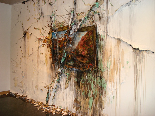
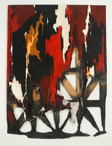
Autumn on the Wissahickon with Tree is the name of this beauty.  There is so  much here, it's so daring!  Like listening to a wild piece of classical music and loving it for the composer's boldness. How can you not love a piece that has a  tree running across it? The tree being cleverly semi-camouflaged with paint a little here a little there. The leaves and chipped paint on the floor really adds to the fall effect. I love the dripping paint all over the wall with brown hues, gray, and a minty green


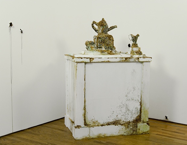
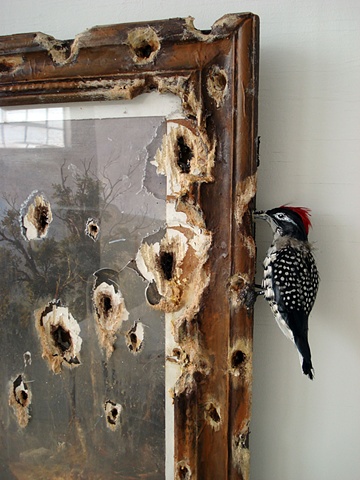
  I like the white in this one with accents of rusty and old browns and greens. Beautifully done. Three bullet holes in the wall with two dripping. But what are they dripping  Since  I am sure that walls don't drip ( ; I must assume that it is paint and that is a very lovely addition to the work. The name of it is Paul Revere Tea Set.
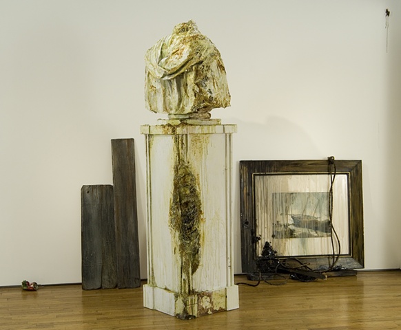
Name: Seascape: Bust with Boards. Off with his head! Well, I guess that I will start off with the backdrop on this one since it is interesting. Starting from the left end of the photo. A partially flattened soda can (I am now wondering what type of soda can it is). Second, two small slabs of wood placed beside each other one shorter and wider, the other taller and more narrow they are very worn looking and dark which is a nice contrast with the mostly white photo. Last, the framed painting with wood that matches the the previously mentioned slabs. I can't see the painting very well but from what I can observe it's very nice. The drips of what may be dust or a light colored transparent paint dripped along the glass. I am not sure why those wires are there neither am I sure what it is that they are attached to but I still like how that hang over the painting. The statue is very nicely accented with age and color as the one above it and is , of course, headless. ;) Let us not leave out the bullet hole at the top right corner of the wall that is dripping that special "insulation blood" up there. I like this one a lot.

First Harvest in the Wilderness with Woodpecker. As you may have noticed, this woodpecker is a very naughty boy. Who does he think he is? Waltzing through here pecking up stuff! Breaking glass and taking names. Woodpecker style ;). Haha, anyways, I thought that this one was very creative and it must have been fun to make. Plus that cute little guy looks real.


Cathedral. Reminds me of antlers. It's a little dark like the front of a haunted house in an old horror film. I like the colors the black and that honey flavored brown. It's quite the gorgeous hue. Sharing its glorious paint job with the white wall behind it.

In the Woods of the Woods. This one starts off like your very average ripped up painting (hehe there is no such thing) then takes a walk on the wild side... literally. Fantastic idea. The foliage on the ground truly adds to the wildness of this piece. I appreciate this artist making her ideas into a reality for all to admire.
 How do I describe this one in one word ... hmmm Burnt! :) The whole painting is swerved and that fits very nicely with the actual painting's style.  It is interesting to see that it melted instead of burning as I would assume paper would. I would have to call this one awesome because I don't really find it pretty but I still like it and love the idea of it.
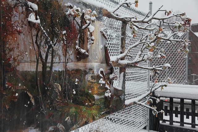
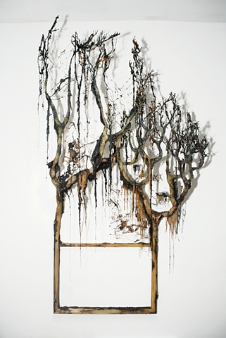
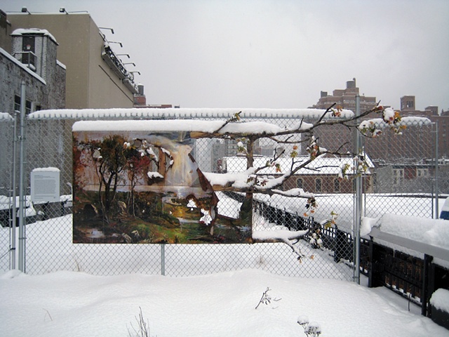
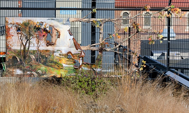
Autumn on the Hudson Valley with Branches. This would be the first work of Valerie Hergaty that caught my eye. Great work. A very large painting that dies in the middle but lives again with autumn trees. The snow is a wonderful effect. I wonder if this is close to her studio or house. Autumn all the way through from the painting to the trees on the end this is Autumn.
Again but with a head on view with a little distance. I suppose that it doesn't really matter which way you look at it, it's always going to be beautiful. I love the little snow pockets that have collected onto the parts of this art that juts out.
In the sun you can see this piece in a different way. I must comment on the rusty metal that curves itself showing off here and there, what a lovely color! 
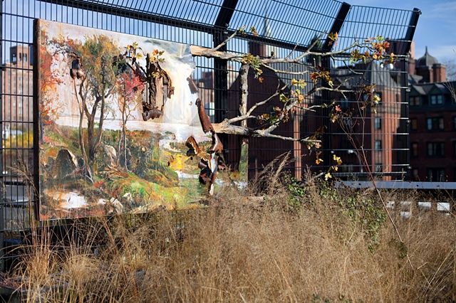
Side view! In the sunshine : ). The placing of this piece is fabulous. I love the wire wall that it is on. You can see that on the end it curves so I am guessing that it curves on the opposing end also. That closed in feel creates a mood when you are observing something as spectacular as this.

Still Burning. I do believe that this name was coined because of the way that the bright red favored colors seem to creep up the painting as flame does while on the painting is actually burnt. Very nice. I love the shade of red here. And the frame beneath is very pretty looking being  90% burnt  and all. :)
Homer's Driftwood This one is definitely one of my favorites for it's mossy green colors and  for the way that it was burned ; not too much around the edges, more so inside of the frame rather than outside of it, and the burnt holes I like simply because you know that it was intentional and required a bit more effort than the more spontaneous style of burning.
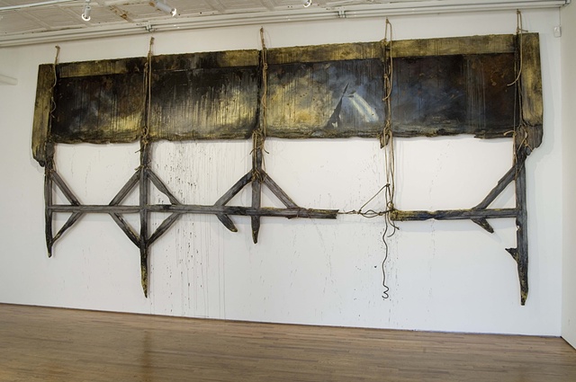
Seascape: Washington Crossing Delaware (Excavated)  In case you were wondering (like I was ) The word Excavated is a verb and it means ; to make a hole or to make hollow by digging or removing materiel. Which makes sense when you take a look at this work of art. The dangling ropes, rotting wood, dripping paint (a little very dark paint dripping on the walls here and there), and general darkness of the hidden painting make this very appealing.
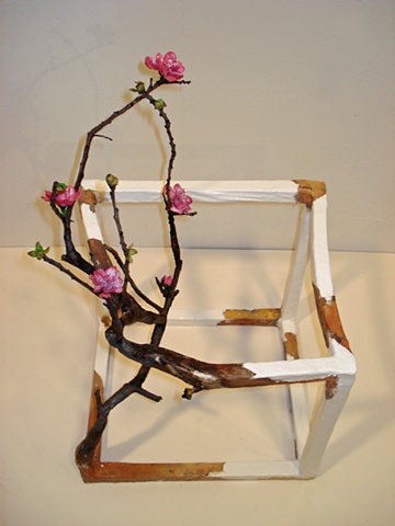
Open Cube with Flowers This piece could have been dark but the pick flowers brighten it. I have a strong appreciation for a small brightness in dark art it can be very moving and beautiful if done correctly. It looks as if the branch is trying to push itself out of the wood. It has been slowly and quietly growing there and is now ready to be seen with pink flowers.
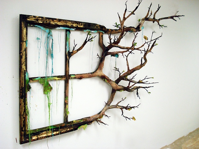
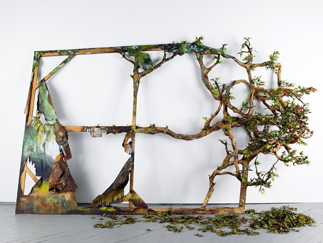
Season's End I love how bright and dark colors can bring out the best features in each other if placed tastefully. Which is the case in these "non-picture picture frame" Again it starts out looking somewhat normal and the gradually increases into something wilder. Very nice touch adding the leaves on the the branches. Not too many not too little for this particular piece of art.
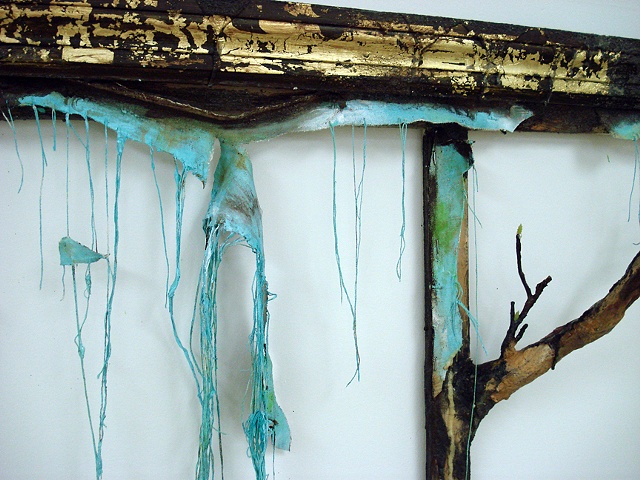
A closer view at that colorful stuff hanging  form the work above in case you were wondering what it looked like a little closer (I certainly was). A very pretty choice of blue a little green and brown there. Gorgeous and torn.


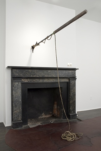
Harpoon. The wall is bleeding again! I swear the walls here are living and breathing with a mind of their own. This one  is awesome! How could you NOT love the idea of a giant harpoon being thrown? I like how the rope is formed on the floor somewhat sloppy but still contained it's rather dirty which is better than it being clean for a photo like this. I love the design on that fireplace. Black with some extra character, superb.


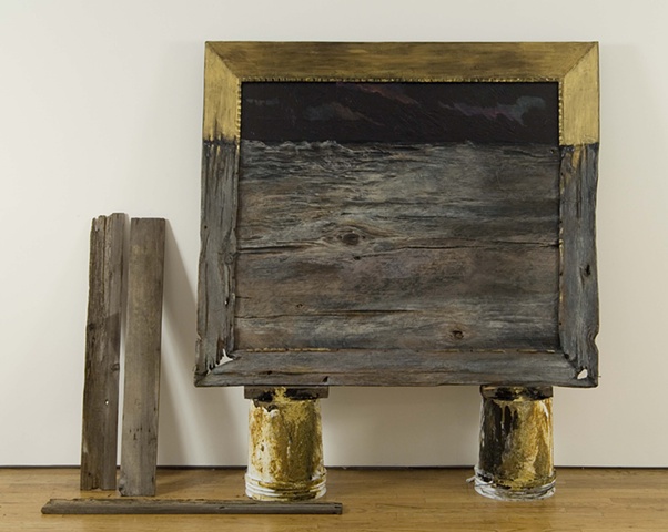
Driftwood Painting This work is here because I love the two rusty cans (possibly cans, maybe paint cans?) that this Driftwood Painting is propped up on.  The golden rust on the cans matches somewhat with the gold on the upper half of  the frame of the the painting. It brings harmony. I like the three piece of wood on the left of the painting two standing  one being more perfect in shape than the other and not looking as worn, and one face down on the ground

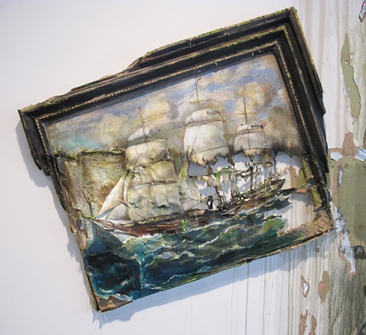
Ghost Ship. Yes, Davy Jones is near .... No, I'm kidding. I haven't seen this painting without it being partly scorched but judging from what I can see  I would have to say that this looks much better scorched than it did untried by fire. First off this painting is tilted which is fantastic because this IS an ocean painting, right? Doesn't the tilt here add a more ghostly storm element to the entire painting to you? The burning does the same thing. Excellent choice in burning the sails the way that they were burned, it looks very real. The green tinge added throughout this painting is fantastic it really says "ghost". I am very impressed with this one. Excellent job, Ms. Hergaty!

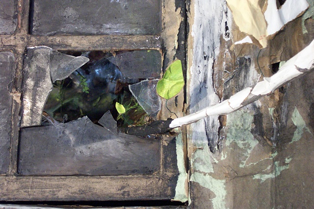
Landscaping. This one is interesting. I see the dark room below, considering the glass squares it is probably a green house, and I see this lone tree pushing above and out of his surroundings in search of new light. The funny thing is that, by breaking this glass first he has made it easier for others to follow after him. I really love the glass here it's foggy and looks so good with it's framed worn wood with chipping paint. Also the wall on the right is very beautifully chipped and roughed in a satisfying way. 


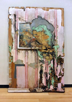
Very colorful and wild. It reminds me of an abstract painting but without the paint. Ah, but there is that  little part of a painting up there and it looks like some green paint splashed around, so I guess that this isn't completely paintless. I like this one it looks like the wall was cut out from a burning house with pink wallpaper and is now placed here for our amusement.  I like the rich but light color of the wood towards the center of the wall. When it is against that creamy green it does wonders for the eye. This one had no name.


Well that is over and done with! I enjoyed working on this post, it took more than a few days, but I still enjoyed it. Thanks for reading! Thank you to Miss Valerie Hegarty for allowing me to feature her work here in the first place. Oh and here is her website again in case you have more of an interest to see the rest of her work after seeing the little that is displayed here. http://valeriehegarty.com/home.html Valerie Hegarty is represented by Nicelle Beauchene gallery in New York here is the link so that you can check that out
 http://nicellebeauchene.com/artists/valerie-hegarty/

One more thing, in case you wanted to see these works in a more up
 close and personal way,there is going to be a  show in May at the 
Brooklyn museum in 3 of the historic period rooms. Again, there is 
so much to see than what is displayed here so please take the time 
to look into it. :) Bye readers!

Sunday, January 6, 2013

Google Doodles

I always like to see how Google changes the logo on their search engine on holidays and on people's birthdays ( that I have never even heard of  mind you ). Sometimes on a holiday I will go on Google just to see what the change will look like. I searched through some of Google's previous logo changes ( they call them "doodles" ) and picked the ones that were most appealing to me by their looks. A lot of them are dedicated to certain persons I am simply just not familiar with  so I hope that you will excuse me in not knowing a lot of details about them or even mentioning some of them. Seriously, the art is what is most  important here.

Dedicated to Dr. Robert Moog on his 78th birthday. The machine above was invented by him and made for music he was an "American Pioneer" for electronic music (eh, it has its place). His invention was one of the first widely used electronic musical instruments . His invention was instrumental (hehe pun) in the making of  music for   artist such as The Beatles,  Stevie Wonder, The Doors, and many others. The coolest thing about this Doodle was that you could actually play with this one! What I mean by that is that you could play a song from your keyboard record it then share it from your Google account. Now I thought that that was pretty awesome!
Vivaldi dedication for his Four Seasons set. I always like to see art similar to this, going through different seasons and times with the same object ( in this case a violin ). I prefer the winter and fall violins here,
my preferred seasons also.
The Addams family dedicated to Mr.Addams himself on his 100th birthday. I like cousin It's hair, personally. And I liked that hand that was "alive". Which now makes me wonder who used the living hand first The Addams Family or The Evil Dead

This one was dedicated to a concert pianist named Clara Shcumann on her 193rd birthday. Being a child prodigy she had her very first concert at the age of 11. And (if you hadn't guessed) she loved children, her own in particular. She risked her life to save them once in a very heroic and brave way... that story is way too long to be presented here if you want to know it use Google for crying out loud! I love the way the piano keys curve with little plants sticking out on the ends. I also like the font of the letters here.

I think that this one is nicely colored and very cool. I really like the window in the back with all of it's different blues. I like how his pants and shows are transparent HaHa which is a little funny considering his dead. I guess that this is implying that his music lives on.

Tom Sawyer! Now I have never read this book all the way through but I did get to this famous white washing scene. Who doesn't like Tom Sawyer? This doodle was made to celebrate Mark Twain's 176th's birthday.

This doodle was made for Child's Arbor Day in China. I chose it to be here because of the colors the colors here are simply fantastic! And all of the little animals, too cute. :) Also the specks on the two closer trees was a great touch making them look a little more real with detail.

Happy New Year! 2013 :D Happy to be here, aren't you? I like this one because of how busy it is which is how a lot of people get around New Years. Haha No worries we'll get over it then start again next year.


Don't ask me who this one is dedicated to. I simply do not know. I just think that all of the different flashing televisions and suitcases forming the word "Google" is super awesome looking. :)
Lol Little Spanish Skeletons celebrating the Mexican holiday "Day of the Dead". I like the colors and their comical faces. My favorite being the representers for the double o's (Yes, James Bond came to mind). Maybe it's because he is the brightest and the most silly looking.

This doodle was made in order to celebrate the discovery of x-rays :) ... Yeah I'm wondering what the key, three balls, and duck are doing there too. But, hey, that's Google comedy. ;)

:D I used to love to read this book as a little kid! It was nice to see it again my "Hungry Caterpillar". It truly brings back pleasant old memories. The writer's name was Eric Carle he also wrote "The Very Lonely Firefly" (I liked that one too) and many others. Oh and not to mention he designed this doodle ; ) It was made to notify the beginning of Spring in 2007.

A Guy Running for His Life on a Treadmill


I saw this today with my family and we laughed so hard. I mean the way that this guys looks back at the wall as if it's chasing him. xD Enjoy.

Saturday, January 5, 2013

The Tiger - William Blake


Tiger tiger, burning bright
In the Forest of the night
What immortal hand or eye
Could frame thy fearful symmetry?
  In what distant deeps or skies
Burnt the fire of thine eyes?
On what wings dare he aspire?
What the hand dare seize the fire?

 
And what shoulder, & what art.
Could twist the sinews of thy heart?
And when thy heart began to beat,
What dread hand? & what dread feet?

 
What the hammer? what the chain?
In what furnace was thy brain?
What the anvil? what dread grasp
Dare its deadly terrors clasp?

 
When the stars threw down their spears,
And watered heaven with their tears,
Did he smile his work to see?
Did he who made the Lamb make thee?

 
Tiger, tiger burning bright
In the forests of the night,
What immortal hand or eye
Dare frame thy fearful symmetry? 
 
  - William Blake
    1794


I really like this poem, I think that it's beautiful. This man is obviously speaking of God when he mentions praises the tiger and his creator. Bringing the up the wonder of many minds in the past and present at the striking differences in the creatures of creation. The lamb and the lion, the angelfish and the shark, the deer and the wolf. In his amazement with the tiger he also expresses his amazement in his creator. And he wonders if God is as impressed as he is with the largest cat in the world.Which , by the way, is not the lion, as many would assume. (;

Tuesday, January 1, 2013

Ash The Painter


Looking at some of my most recent post that feature the art of painting  I found animals and that wildly beautiful abstract art. But now here are some portraits of people, mostly women. The theme, for the most part, being natural kinky-curly hair. Happy New Year! ( :


She Bad. And that she is, I love her hair! The different shades of green curly locks is just beautiful. The little splash of green around her eyes is just fabulous. Her gray/black lips really add to her edginess. She reminds me of a punk rocker.

Green and orange. Great combo! Look at those lips ,great coloring there along with that glossy shine look that she gave. I love how bright and bold the orange is on her earring. Beautiful. Check out how her hair is green with a little yellow and maybe some orange and not just black. This woman looks as if she had a rough life and despises her situation and most of the people in it. Orange Earring.


Blue Like Morning. A club girl here with her decked eyes and extra glossy full lips. I love that hue of blue that is swiped along her eyes and eyebrow. And her hair, with these paintings you always fall in love with the hair. I like how beneath her hair on the right it's pink (with a little green)  and on the left red. The imperfect exposed curls hanging show what each individual curl patterns after leaving the imagination something to grasp when observing the black mass of hair that is displayed here. She has a very seductive look but not in a inappropriate way, very balanced. Very well done.

The name of this one is Garden Red . I like her pink cheeks, red lips, red eyebrows and ,best of all , purple freckles! That is so outside of the box. Very nice. A little purple along the eyes and in the backdrop, a very soft hue, which helps the purple freckles blend. Blue in the backdrop, also on the left in her hair (A little on the right also) and against her nose on the right. And let's not leave out all of that green! Wonderful colors here. This girl looks sad to me.
A closer look at those freckles. ;).


My mom calls this one Psycho Lady which is very fitting, I think. This woman looks tough and wild, like she wouldn't hesitate throwing up her fist to fight. I like the blue and orange combination,  her lips, brown eyes, her nose is cute, and how the light is shining on one side of here face and not on the other. Which I think is more effective with the blue/purple (shaded) and orange/red (light) combo. The small amount of green added here was a very nice touch. The name of this one is Tad of Sun.

Qash! I just adore doodles C: I'm an absolute doodle lover! Well, just QASH! I'm not exactly sure what Qash is or even it's significance. I've kept it at it's original size in order for you to see the word "Qash" written at the top of her dress across her chest. Very creative designs splashed through this dress. I really like the inkblots, I love the drip look. I also like the way that her hair was drawn the wiggle look ;). And I think that it's way too cute how she's just in an absolute huff! Lol

Ah, one of my very favorites (If I didn't care for a painting it wouldn't be here without me mentioning that I didn't care for it). Named Lots-A-Texture. I am just in LOVE with this one's hair. I want to rock a an afro like this! The dark green and yellow on the eyes and lips (those eyes and lips being beautifully painted) being tossed up (yellow on top green on bottom for the eyes and Green on top and yellow on bottom for the lips ). I call that a yellow but it's more of a dark lime green with a yellow like flavor. The shape of her face and her thick eyelashes, this girl is beautiful. The exposed curls take on a partly detailed partly smudged-like water color look. I like how only one eye is shown. She looks sad to me but an underneath kind of sad. A sadness that does not want to be noticed or discovered. Oh, The artist signature is green and not in just one shade which I think is super cool. I have decided to purchase this one if possible.


Music in Headphones. My favorite thing about this painting is caught between that small smile that this guy is sporting, which makes him look laid back and cool (especially in combination with his kind eyes), and the fact that he is listening to music (;. This artist specializes in painting women so it's nice to see her paint a man. Not saying that I don't like to see her paint women because I think that she brings out the best in the natural look of a woman but still I am interested to see what she can do with a more masculine face. I like how around his eyes it's mostly gray which helps with that soft nonthreatening look. A nice little twist on the very common gray-scale and yellow look. There is even some dark green present here and there. The paint here is so splattered, I just love it. I like how his beard is done it looks very realistic along his cheeks. The headphones are nice I like how detailed they are and the cord dangling which a lot of people in drawing a person with headphones tend to omit. I think that his nose and lips are awesomely painted. I love the shape and colors of both. The whole top of his forehead is like a mini-madness with the bubble like white paint on the right and the splatter on the far left. I happen to like that madness.

 The Fro Profile. Very dark and lovely a little turquoise and green in the hair but this is generally a dark painting with this girl's dark tresses, chocolate skin, and dark make up. I love the way that her eyes are done it's a great thing to be talented in portraying eyes on paper.

 Jaaden's Jream this one is special because it was the first one that she painted that featured natural hair (which you can see is really working for her). I love how her body was painted she did a great job on the shoulders and arms the bend at the wrist is very real looking. The way that the right strap of her tank-top is sliding from her shoulder a little bit is a nice detail. Her skin tone is awesome where it darkens and lightens was very tastefully done. Haha, and the natural zombie lady on her shirt is cute. And let's not leave out that boss fro up there! It's so big that she had to leave some of it out of the painting! I do like the way that her hair is sticking out ion a more clumpy fashion in some areas rather than just a few curls here and there it helps you to understand the texture of her hair a little better.

Marylin Monfro This one made me laugh. I mean, seriously, when I think of natural kinky hair Marylin Monroe is on of the farthest people form my mind. I am luvin' that fro though. Mostly black but craftily added are blue, green, grayish, white, gold, and red dots and curls. The dots really point out that her hair isn't just curly it's kinky. Ah, and her lips shimmer.
My favorite thing about this painting would have to be her lips. They are so pretty, in shape and in color. I love the blue in her hair, a little green there too, some orange, but I just adore that blue. Her eyes are so pretty with her heavy lashes and so is the red flower in her hair. Also, I love how she did the skin here. I'm not sure what you call that technique but it is definitely fitting . The orange, red, and yellow are put together so well to make her complexion. Very nice. Hmm I like the blue about the neck and the red on the opposing end.

 This painting is called The Big Chop which is something that women will do , by "something" I mean cutting most of their hair off to this length or similar, in order to start off fresh. Hair that has been abused and misunderstood is given a chance to show off what true beauty it really holds by starting clean and staying clean. Everyone's idea on "Going Natural"are different ,of course, but most basically lay off of the chemicals; no perms or harsh dying or bleaching techniques on the new hair. I think that it's a brave thing to do.

Autumn Attitude. I love this one most people do, I think. Maybe it's those lips. They are the center of this painting gorgeous and full. Lol Lumpy on top which makes you look at them longer because they aren't just your average set of lips. Oh and the hair! The shape of her fro is so cute to me. I love the colors and the texture bold red that flirts boldly with orange and slyly with yellow. Miss Ash sells t-shirts featuring Miss Autumn Attitude in black. And she looks nice in just about every color and black is so far from not being included from that good-looking category. Go Autumn!


Suga' Cane. You may not believe this but my favorite thing about this painting is ... the cane! I love it's coloring, especially at the top. That is something to be proud of right there. I like the way that her shirt is folding on her right side and I like that the cuffs of her sleeves are blue and white. Yellow and blue together? Thumbs up ma'am. I like her pouty lips they look so big compared to her small face and so does all that hair! The smoky technique around her hair I like in particular because it says that her hair has less curl definition to it and has more of a kinky-textured look to it.


Retro Colors. My absolute favorite thing about this painting is this girl's lips their color, shape, shading, how they are slightly parted. The yellow and blue flavored green lines that make her face go very nicely with the bubblegum pink lips. Her hair is nicely textured, as always with Miss Ash, and her lashes are very thick and heavy. Her eyes are big but still almond shaped.

Don't Touch My Hair. Originally called "Ugh" I just LOVE how you can see her gums and not just her teeth. Her teeth look so real too. Her hair is a mess of colors. A feisty red, a bright green, a deep black, a pink-like purple, and a calm blue that made it's way to the corner of her mouth also. Her chin is drawn with a light blue and not black. I am guessing that this was done to not draw attention to the chin considering that her nose does not have a definite shape and that her eyes are covered . The main focus here is the mouth (with it's glossy lips) and hair (with it's overall wild look). She looks so angry. Very well done. If it were available for purchasing I would buy it.


Wet 'N Wavy. This is one that I hope to have hanging on my wall soon. Green, turquoise, white, and black are the main colors here.  I like the green mole. I like the shape of her nose is very cute, I like how it was painted with both blue and green. Her eyes have a great blend between blue and green. Her hair was cleverly painted as to show curl definition (lol or wave definition) not looking straggly yet still not just a mass of hair. The coloring on the lips is gorgeous, how the upper lip is darker with colors and the bottom lip leaning towards a white sheen. The light touch of turquoise under her chin and on her neck is wonderful choice of shading. You can literally see her eyelids, they are black and tinged with green and a little blue. The eyelashes are also black tinted with green. Th eyebrows starting black, flirting with green, then ending in blue. A little yellow spread out over the hair which is nice for a painting with mostly cool (blue, green and purple) colors. And speaking of warming up a painting filled with cool colors checkout her hair tie! It's RED! That's awesome. We love red it's so bold and loud.
Chill No. 2  I like this one because of how her hair is dripping. One of the best things that paint can do is drip. This painting reminds me of every bubblegum themed song I've ever known. Basically it makes me want to sing. :)

I love her little smile it makes the painting feel happy. Haha That's really funny because I just looked up the name of it and it is Joy. Fitting, right? My absolute favorite thing about this painting is how it's still wet at the top.

This one is a little dark, that effect was provided by the dark purple lips and the fact that she lacks the small smile that the woman above shows. Her ears look pretty real. I like her nose how it's not edged with a dark color harshly just a light addition of red around it to imply a shape. My absolute favorite thing about this painting would have to be the puff ball on the top of her head. I am just in love with that red, white, and black mix. I couldn't locate a name for this one.